Websites
A little transparency.
Necessary storage keeps your preferences. With your permission, our analytics measure repeat visits and estimate your city using MaxMind. No Google Analytics. No advertising trackers.
Brand identity & custom WordPress development

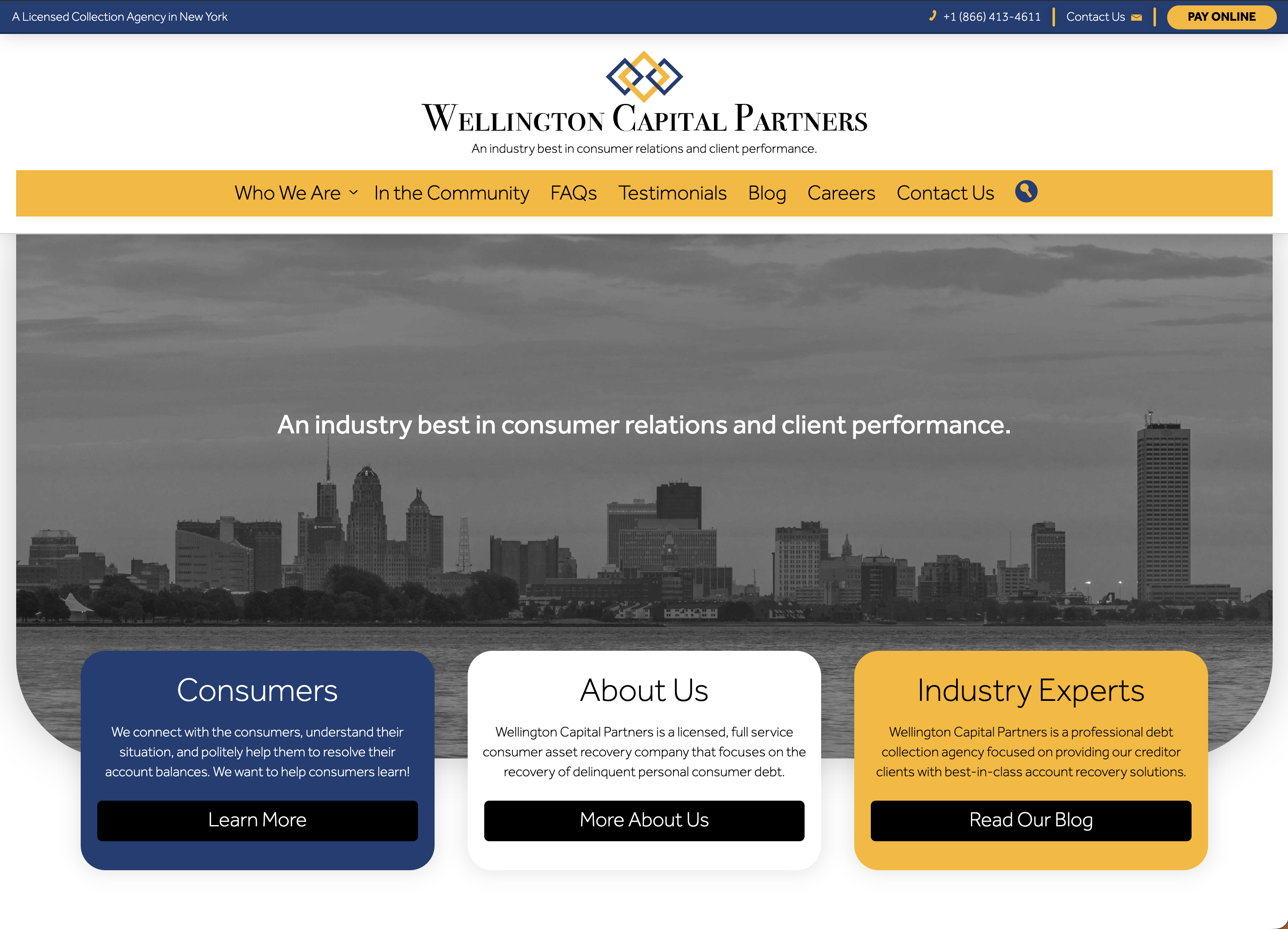
I built Wellington Capital Partners’ website from the ground up, including logo and brand design and a custom WordPress theme. The project brings consumer information, company background, financial-awareness content, and community stories into one consistent presence, supported by Microsoft 365 email integration and AI-readiness work.
The interlocking logo, blue-and-gold palette, and consistent typography give Wellington a recognizable identity across the website. Distinct entry points help visitors find consumer resources, learn about the company, or explore its content, while contact information remains prominent.
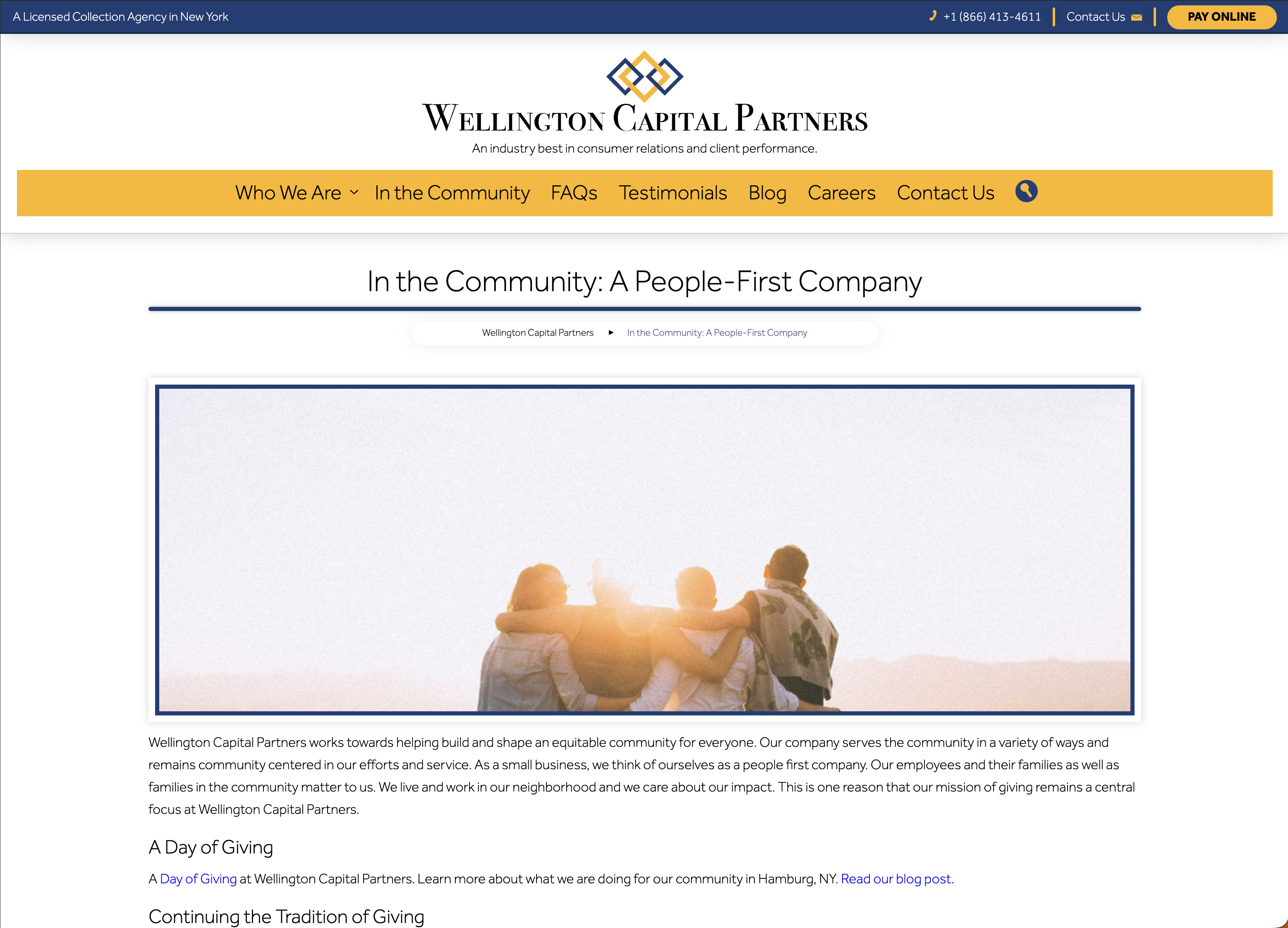
The website makes space for community stories as well as day-to-day information. Dedicated pages and links to related posts connect the company’s public identity with the activities it chooses to share, giving visitors more context than a short company description alone.
The financial-awareness blog forms part of the website’s content offering. The custom WordPress build gives those articles a consistent home alongside FAQs and company resources, creating room for ongoing publishing beyond the initial launch.
I developed the theme as part of the ground-up website build, carrying the brand through page layouts, navigation, and the blog experience.
The project included Microsoft 365 email integration, connecting business communication with the wider website setup.
AI-readiness work accompanied the website build, alongside the core task of presenting company information and resources clearly. The public experience remains focused on useful information and direct contact.
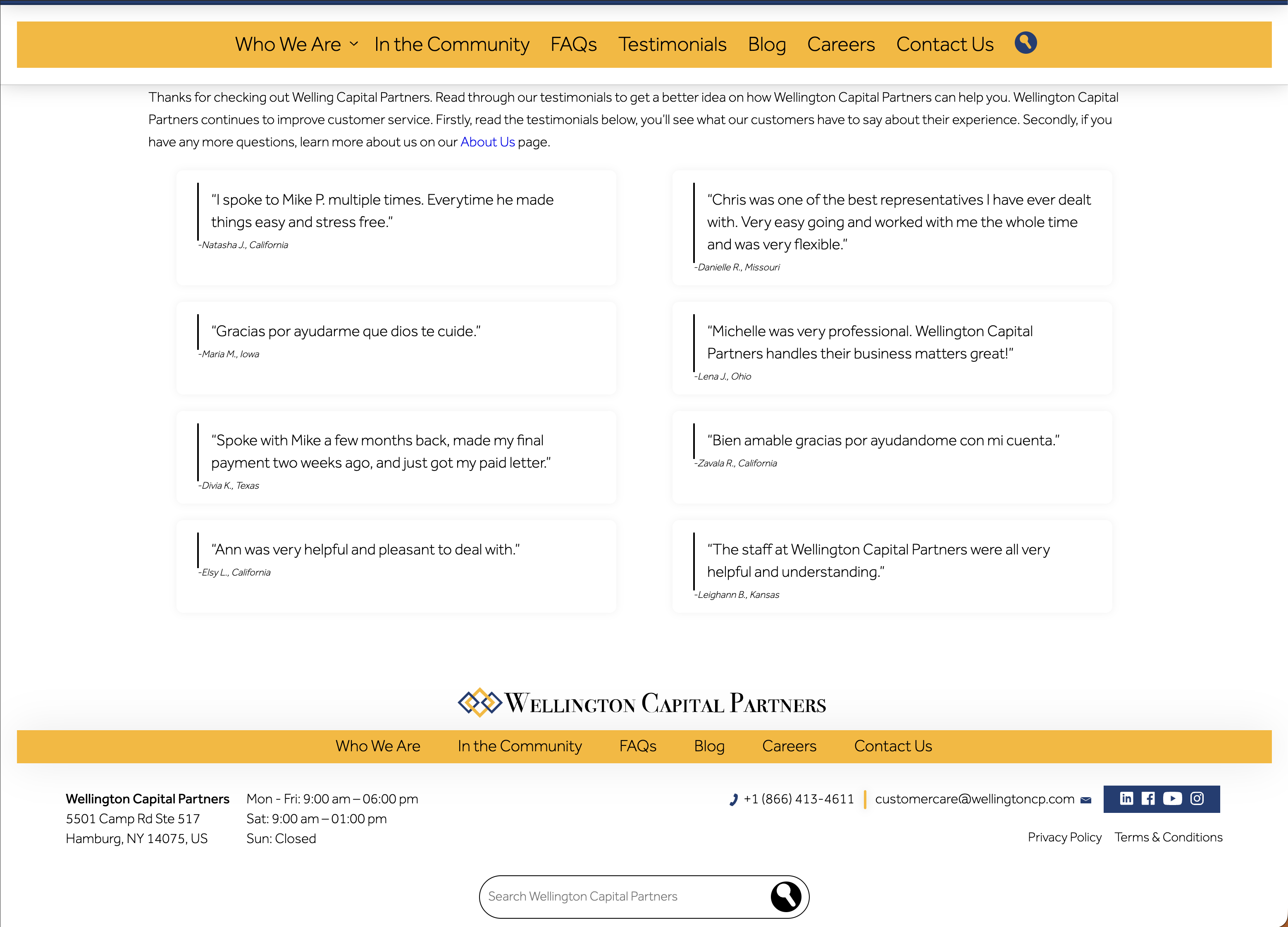
A consistent testimonial layout supports the company’s published feedback, while the footer brings navigation, contact details, office hours, and search together. These practical elements help visitors continue exploring or reach the team without losing their place in the site.
Have something in mind?
Share what needs to work better. We’ll find a practical way to move it forward.
Discuss your project